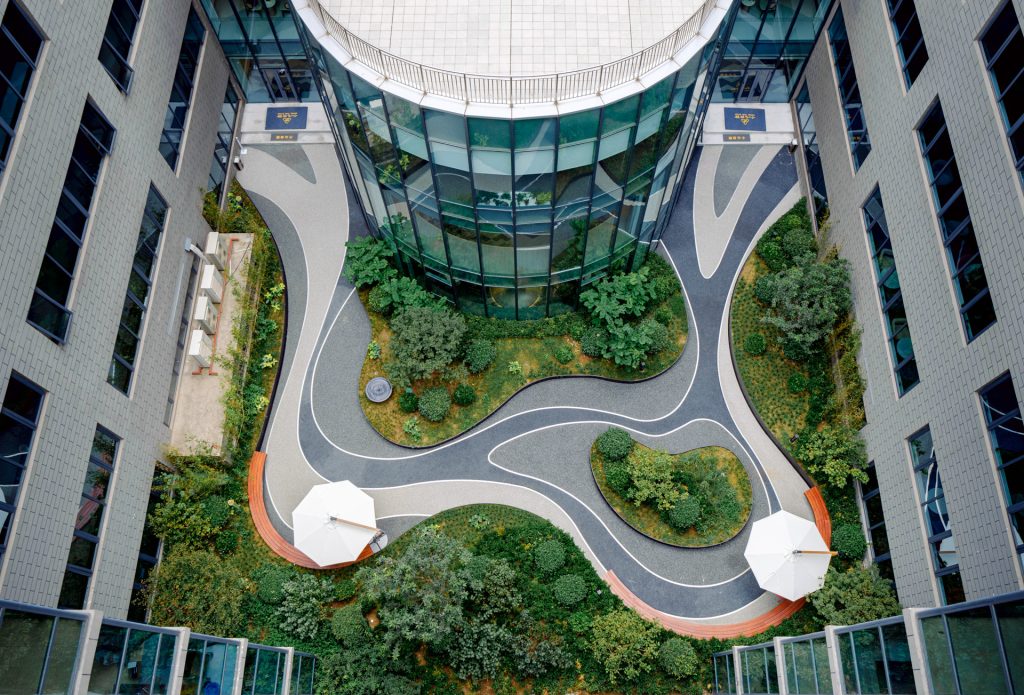
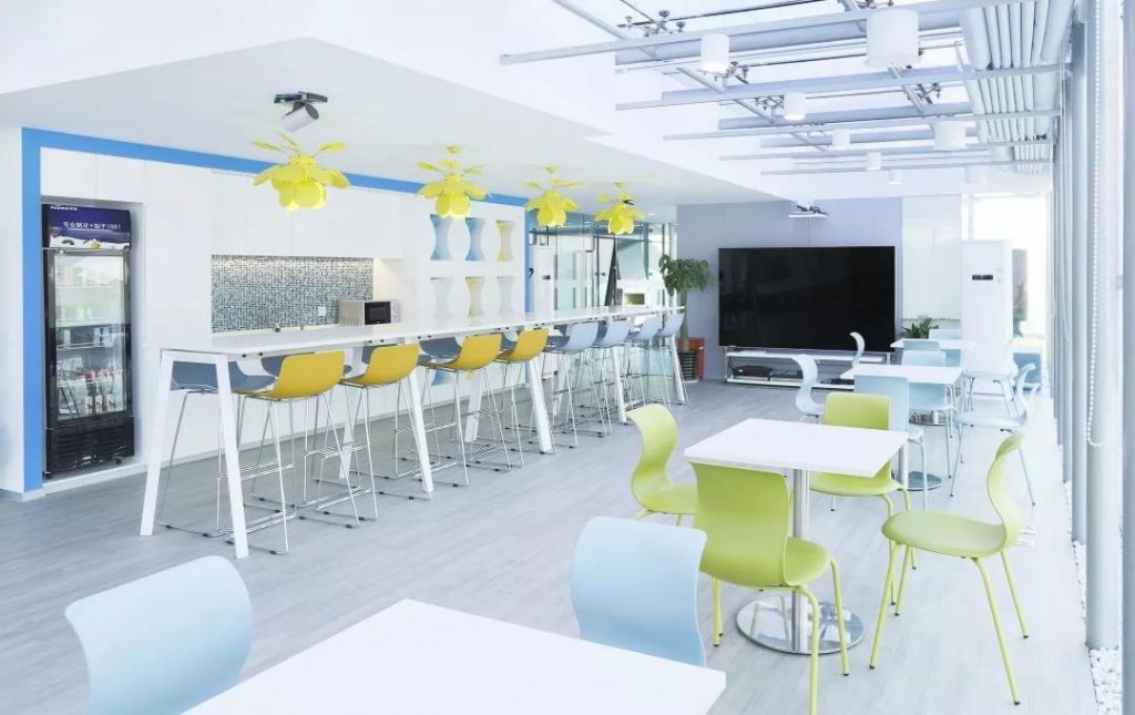
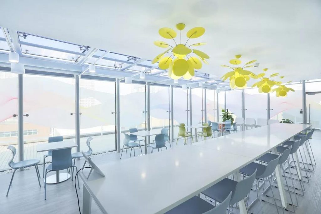
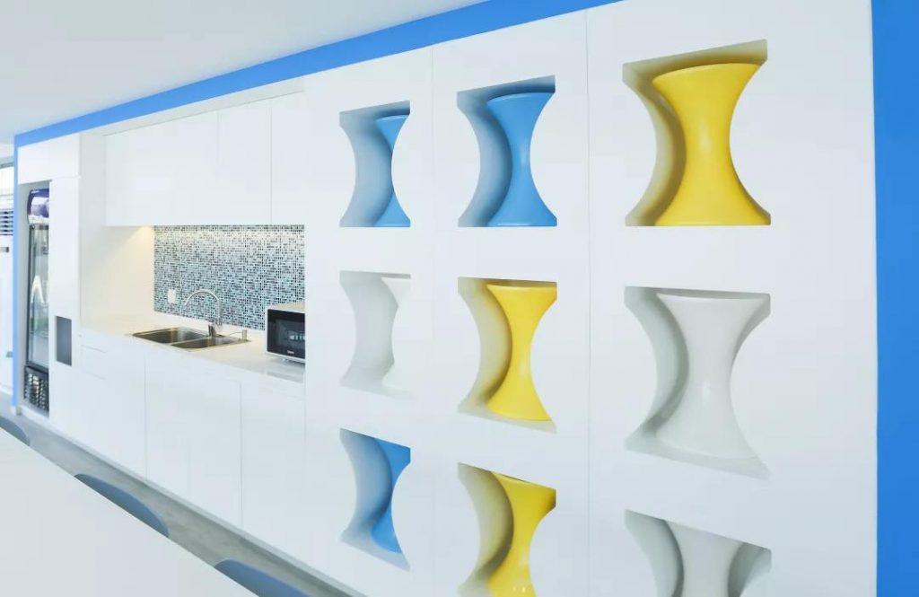
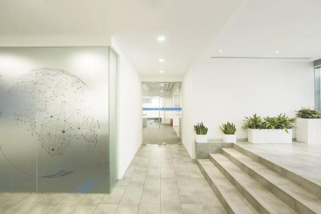
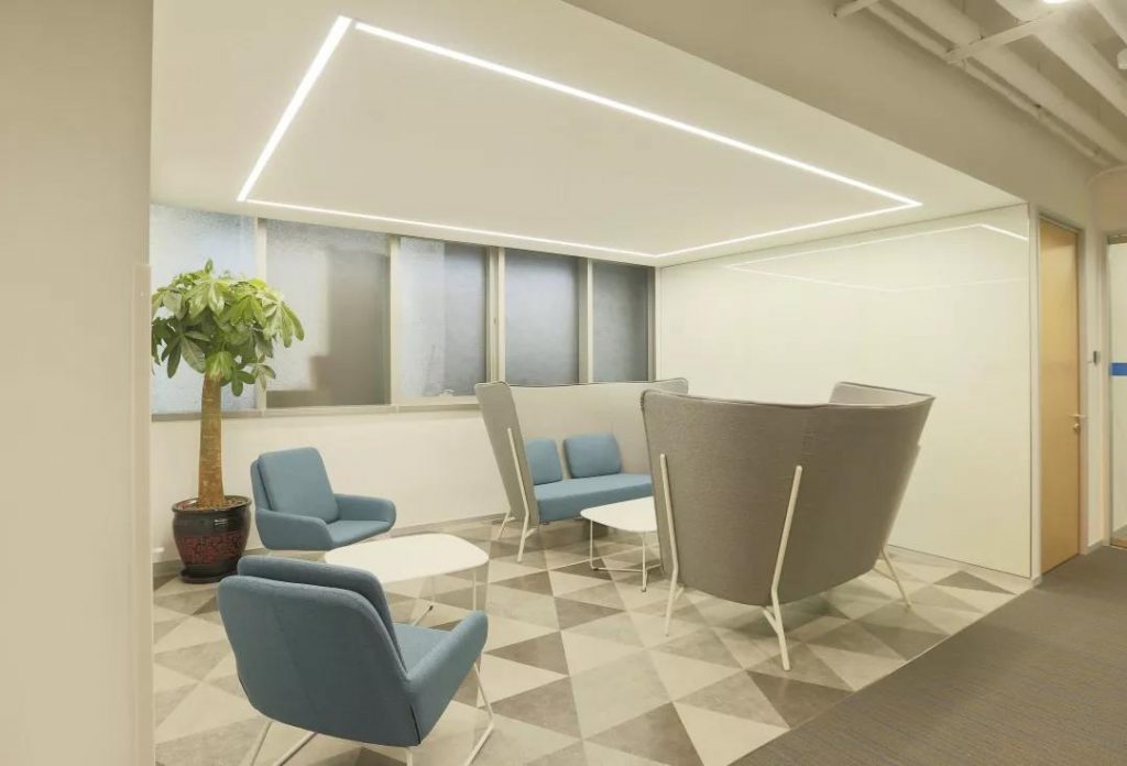
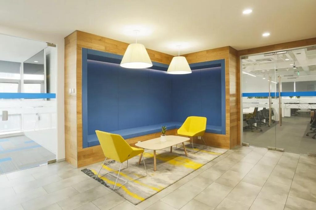
LinkedIn’s Chinese name, 领英 (Lingying), translates to 'leader' and 'elite,' reflecting the platform’s prestigious positioning in China. This ethos has also become a guiding principle for WTL Design’s professional approach.Blue, reminiscent of the vast ocean and yellow, evoking the warmth of sunlight, define the lobby’s two distinct reception areas. These contrasting tones—cool and warm—symbolize wisdom and vitality, creating a harmonious and balanced waiting experience for visitors. In the entertainment room, the design team prioritized both functionality and aesthetics, selecting furniture that is as practical as it is stylish. Bold color combinations bring the space to life, resulting in a vibrant, playful, and contemporary atmosphere.For the nursing room, leisure area and spacious corridors, natural hues and eco-friendly materials were carefully chosen. These thoughtful details reflect LinkedIn’s deep respect and consideration for the diverse needs of its employees, fostering a workplace that is as nurturing as it is inspiring.
扫码关注微信