LinkedIn‘s Chinese name, “领英”, means leader and elite; perhaps that is the positioning of LinkedIn in China. It has also become WTL Design’s primary professional direction.
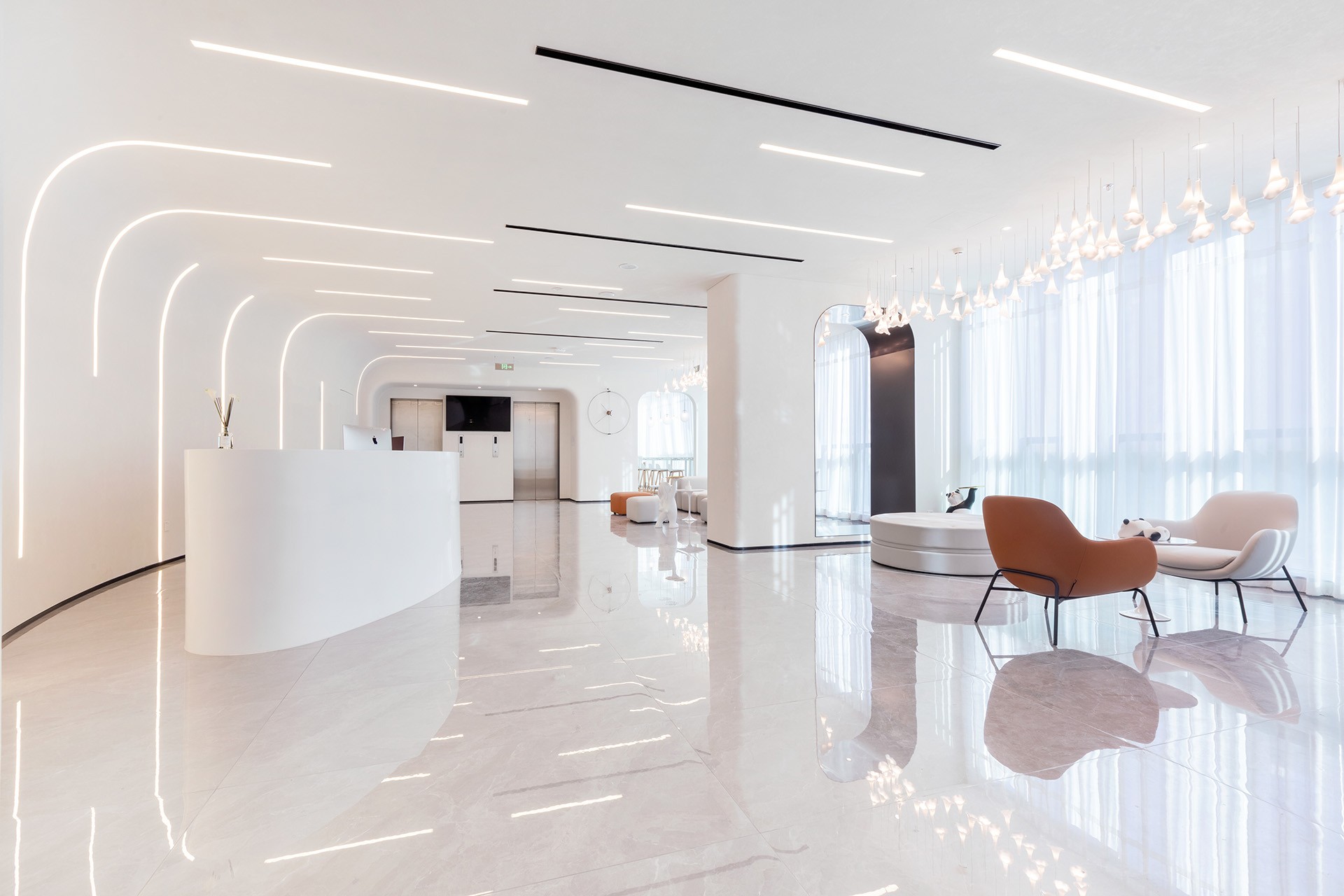
Blue is the symbol of the ocean. Yellow makes us think of sunlight. The lobby area is divided into two separate reception areas by these two colors, one cold and one warm, symbolizing wisdom and vitality, therefore creating a balanced waiting experience for visitors.
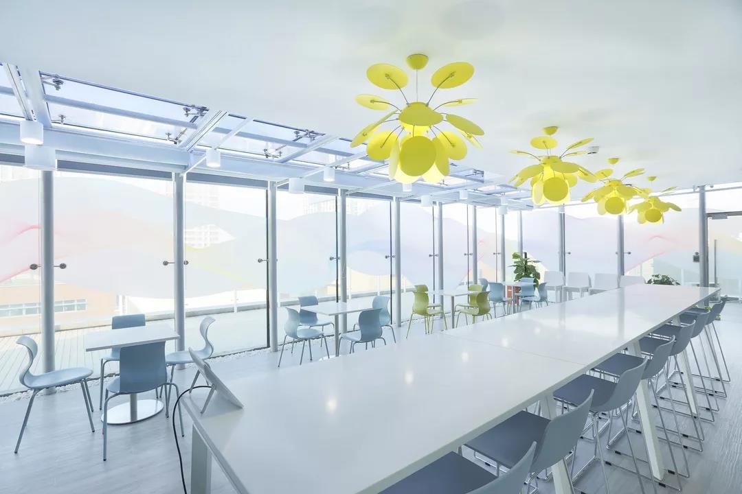
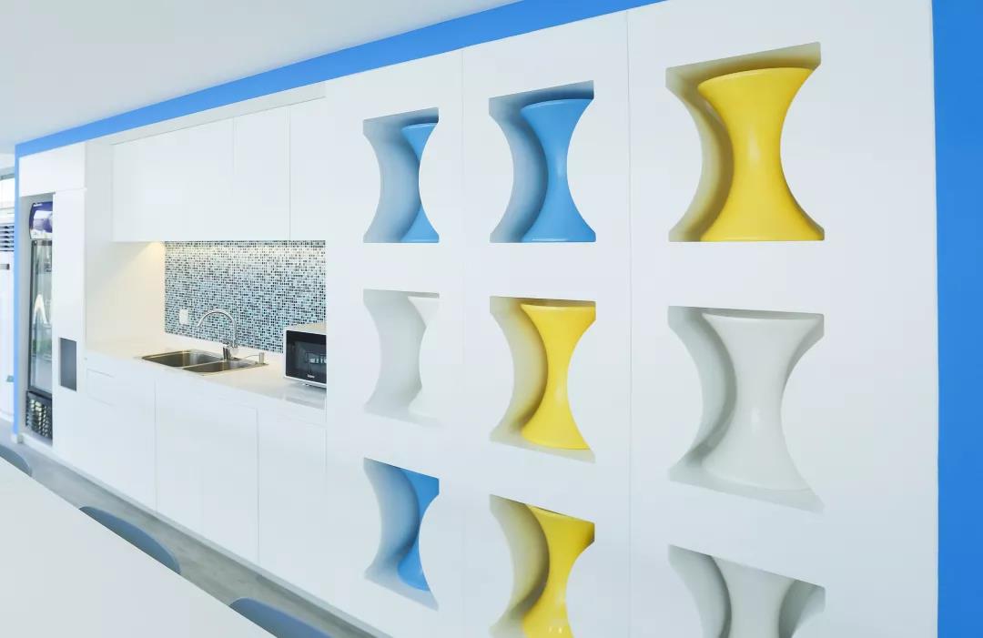
In the entertainment room, the design team not only considered the functional practicality in the choice of furniture, but also worked hard on the color matching, and finally presented a bright, fun and fashionable space.
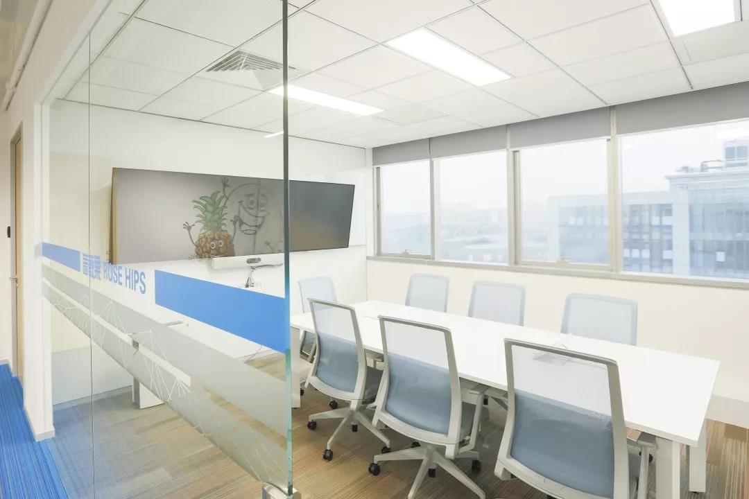
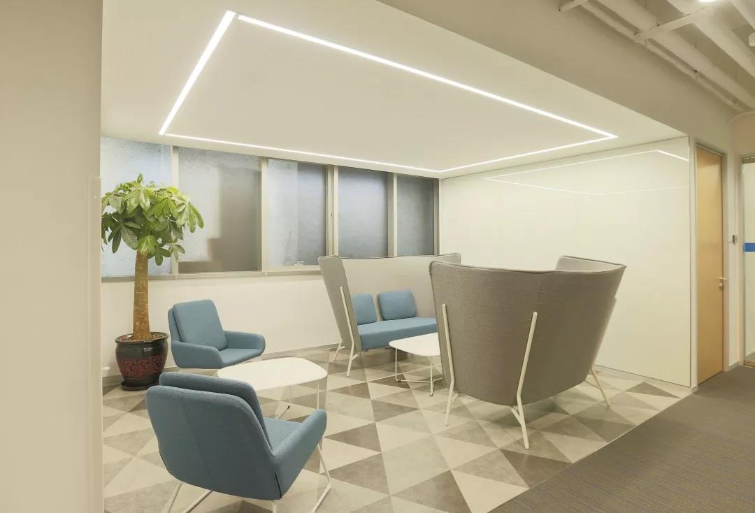
In the nursing room, leisure area and spacious corridor area, we used natural colors and more environmentally friendly materials. The details reflected the company’s respect and care for employees’ different needs.
Design | Construction
2020
Beijing
903 sqm
Previous
Next
“Rational conceptual design allows work to be turned into a journey: encounter, acquaintance, companionship and communication. It is easier to narrow the distance between us in this “community” environment because of the spontaneity of everything, which brings more creativity and joy to work.”